

GenogramHow to Create a Genogram with FamilyAxis

Ready to create a genogram? This step-by-step guide shows you how to build a professional-quality family diagram from start to finish. Ideal for therapists, social workers, and anyone mapping family relationships.
Whether you're a therapist visualising a client's family system, a social worker documenting relationships for an assessment, or an individual exploring your own heritage, a genogram is a powerful tool. But creating one by hand or with generic software can be time-consuming and messy.
The FamilyAxis Genogram Tool was built to change that. It’s a free, web-based application designed for clarity and ease.
This guide will walk you through creating a professional-grade genogram.
Useful Terminology:
- Node: The shape representing a person (like a square or circle).
- Edge: The line that connects two nodes, representing any type of relationship or connection.
- Anchor Point: The small points on a node where edges connect.
Step 1: Launch the Tool – No Login Required
Simply head to FamilyAxis, click tools, and you'll see the link to our genogram creator. There is no need to create an account, so you can begin by selecting "get started" under the heading "Genogram Creator Tool".
Step 2: Understand Your Workspace
After clicking “Get Started,” you’ll enter the main editor. Which will look like this:
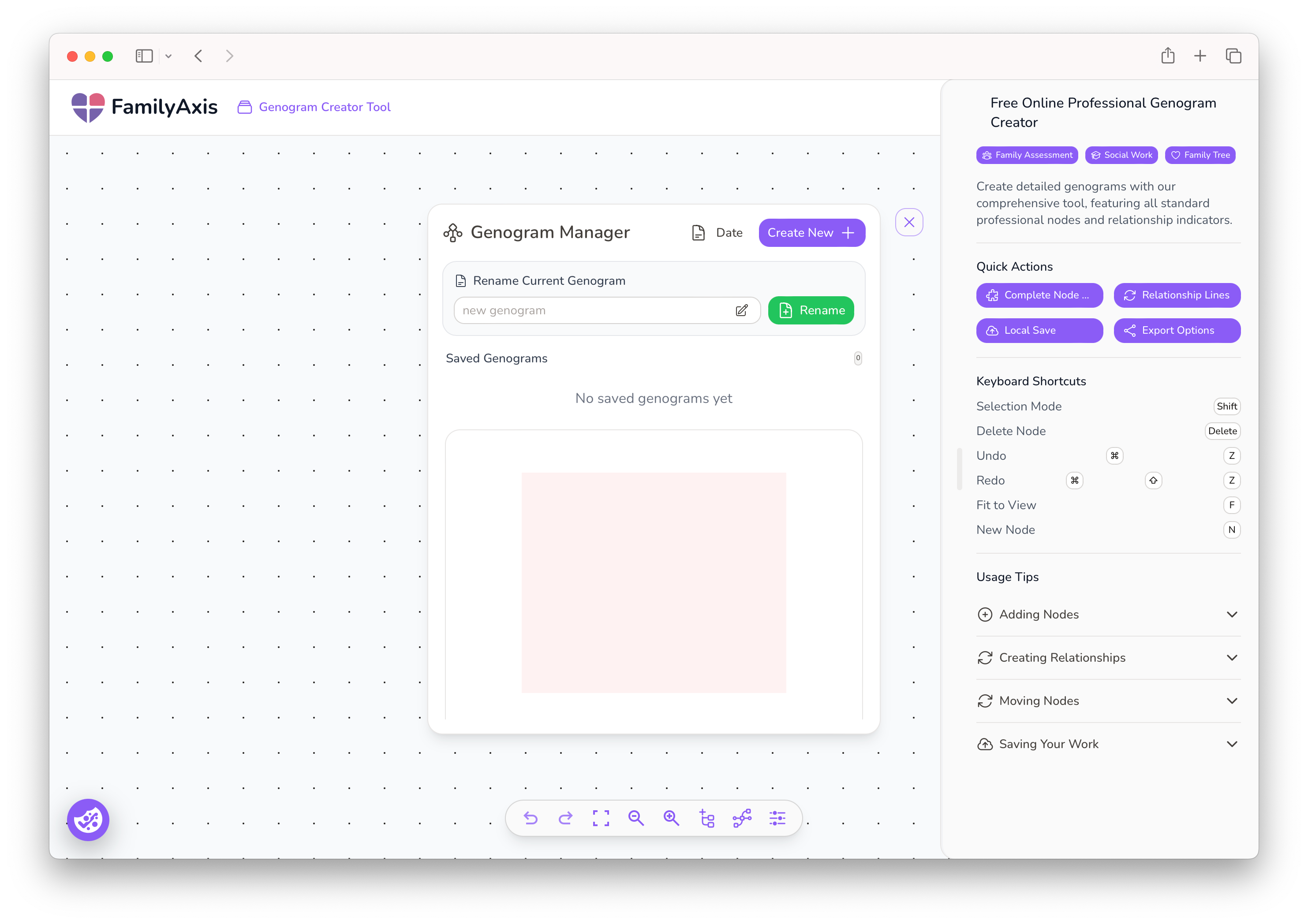
Let’s get familiar with the interface:
- Name & Create Your Project: In the centre, there is a pop-up box where you can name your new genogram. Click "Create New" to open a fresh canvas. You can also see and select any previous projects listed here if you wish to continue working on them.
- The Canvas: The large central area is your digital drawing board where you will build your genogram.
- The Toolbar: Located at the bottom of the screen, this is your command centre for adding new elements like people (nodes) and anchor points.
- The Tips Panel: On the right, you’ll find handy keyboard shortcuts and usage tips.
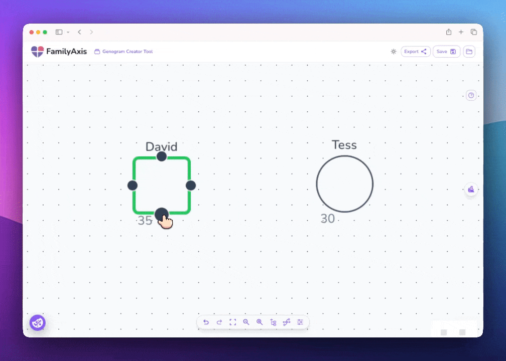
Step 3: Add Individuals to the Diagram
Click the “Add Node” button in the toolbar at the bottom of the page. The 'Configure Node' dialogue box will appear, which is your tool for defining every detail about an individual.
Here, you can customise the node extensively:
- Input Core Information: Enter the individual's name and age.
- Select a Symbol & Identity: Select "Type" to choose from a range of nodes to accurately represent each person's identity, e.g. woman or man.
- Designate the Main Subject: Tick the ‘Main Subject’ box to indicate who the genogram is about. This will outline their node with a bold, distinctive outline.
- Mark Deceased Individuals: Simply press the "Alive" button. A diagonal cross will automatically appear over the node to indicate the person has passed away.
- Add Health & Lifestyle Indicators: Click the "Add Indicators" button to select from a set of standard symbols, such as S for Smoker, O for Obesity, and L for Language Problem.
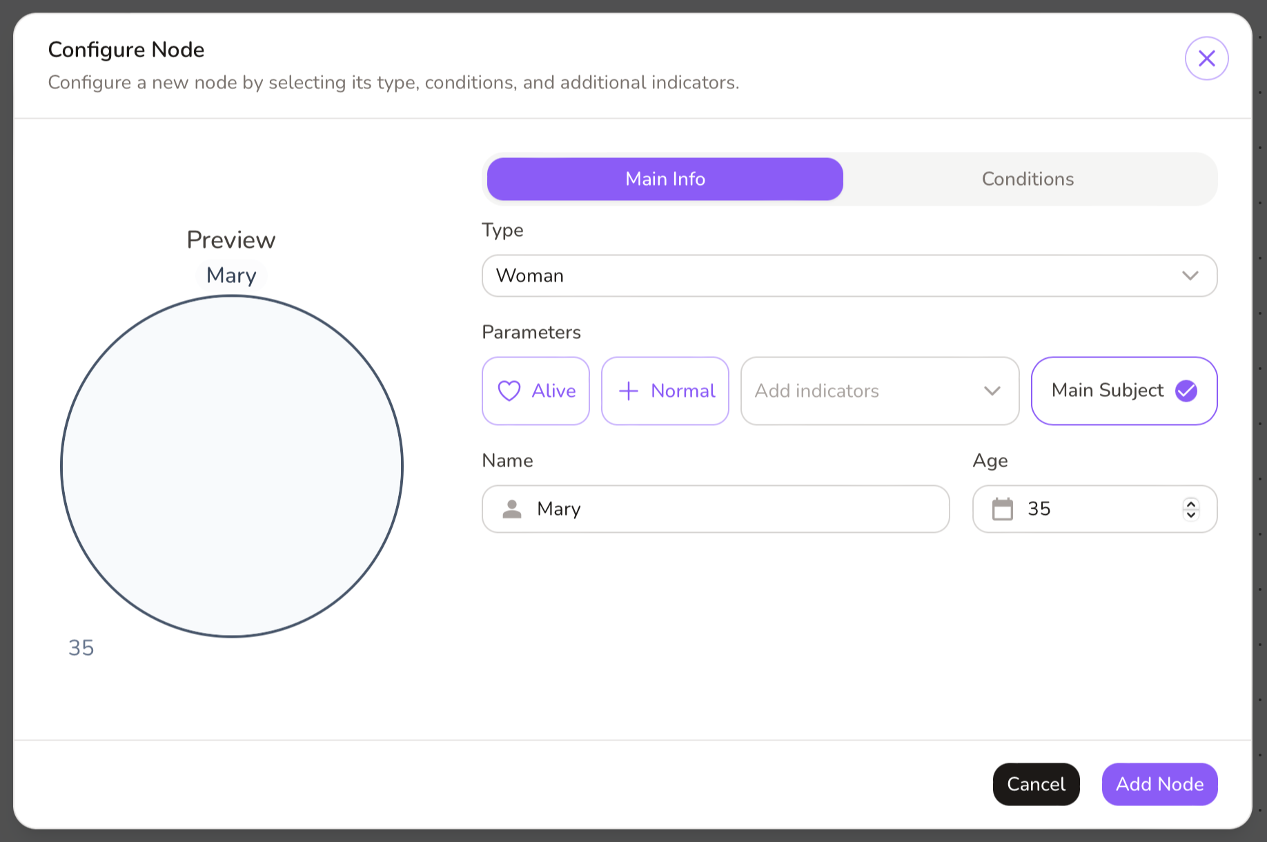
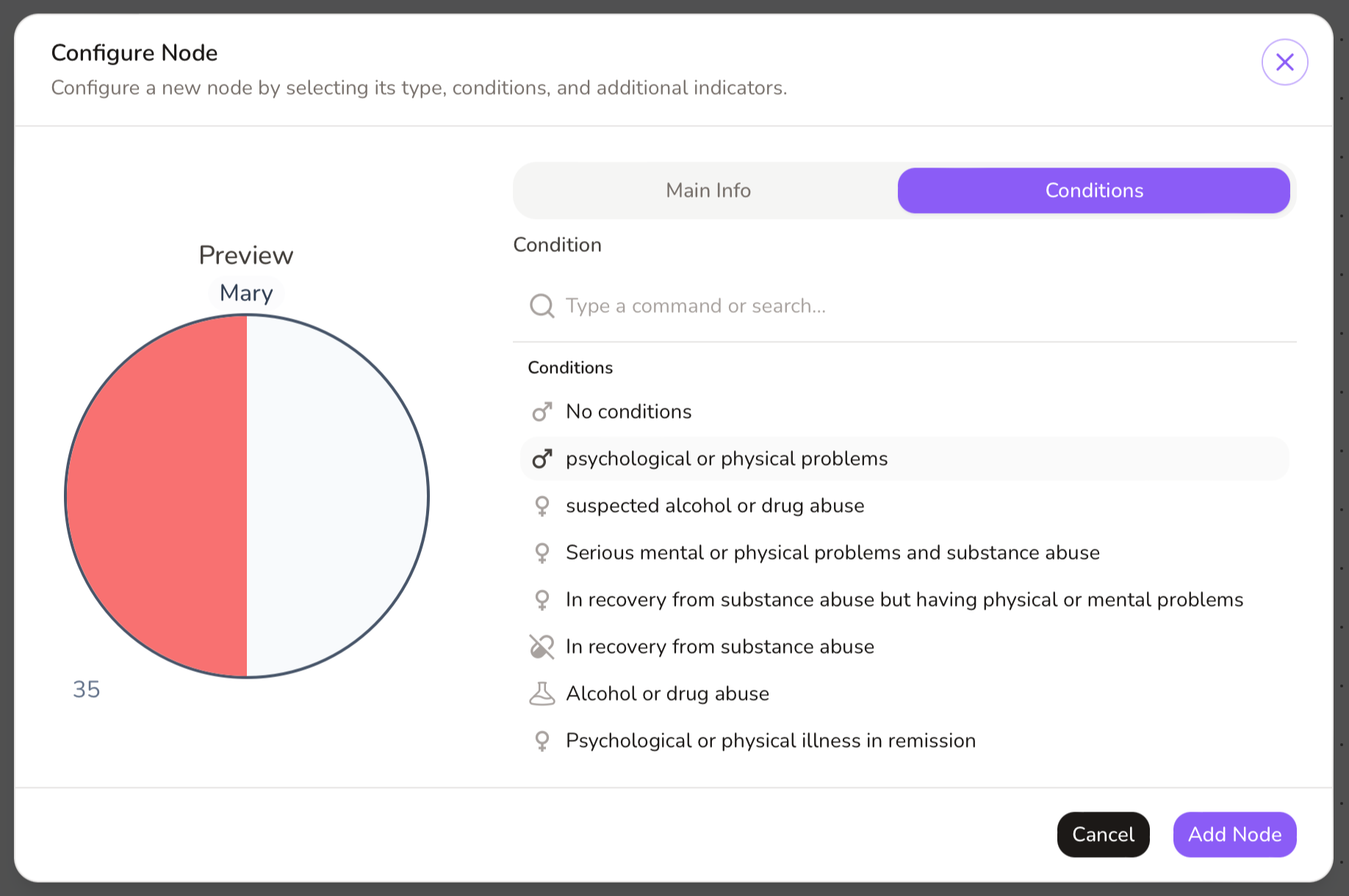
Note Key Conditions: Select the "conditions" field to note challenges, such as Alcohol or Drug abuse, which provides a deeper layer of insight.
Once you have configured the node, click "Add Node", and the fully detailed symbol will appear on your canvas.
Pro Tip for Professionals: Using initials instead of full names during the drafting phase helps maintain client confidentiality. You can easily update this later for the final version.
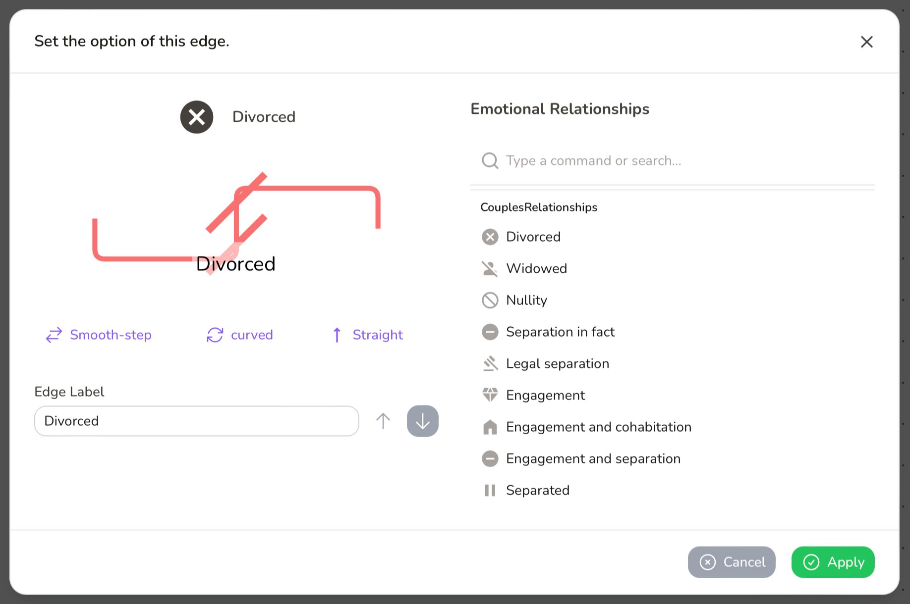
Step 4: Define Relationships
This step is for selecting the type of relationship between individuals, such as marriage or divorce.
- Locate the Bottom Anchors: Each node has dedicated anchor points at the bottom specifically for these structural links.
- Connect the Nodes: Click on a bottom anchor point of one node and drag the line to a bottom anchor point on another node.
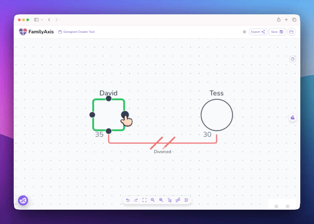
Label the Relationship: Once the line is created, right-click on it. A context menu will appear, allowing you to select the relationship type (e.g., Married, Divorced, Cohabiting).
Label the edge and click "Apply" to confirm. The line will update to display the standard genogram style for that connection.
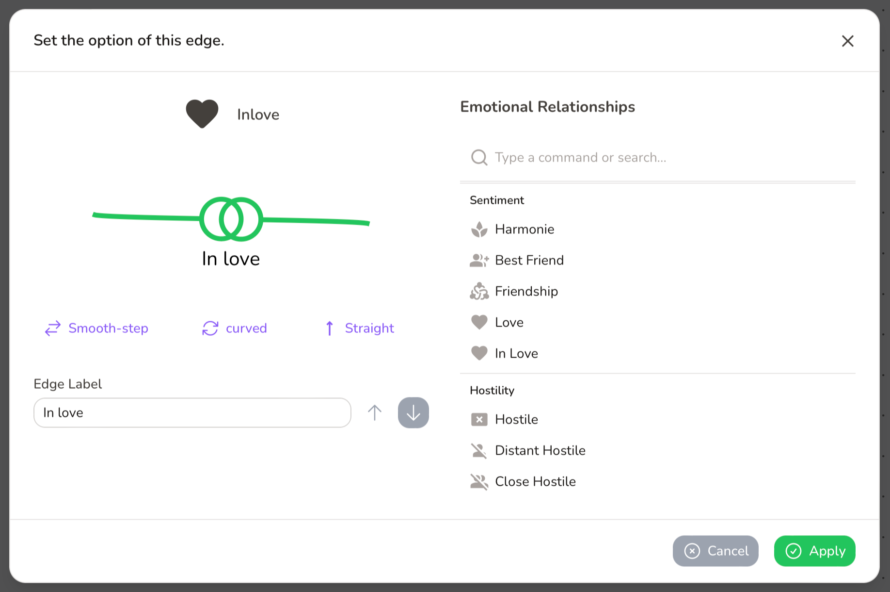
Step 5: Add Emotional Connections
This step allows you to map the psychological and emotional dynamics between individuals, such as closeness, conflict, or dependence.
- Use the Side Anchors: For emotional connections, use the anchor points on the left or right sides of the nodes.
- Draw the Emotional Line: Click on a side anchor from one person and drag it to a side anchor on another.
Define the Emotional Bond:Right-click on the new line. From the menu, choose the nature of the emotional connection (e.g., Love, Friendship, Hostile). The line will automatically change to a unique style (such as dashed or differently coloured) to distinguish it clearly.
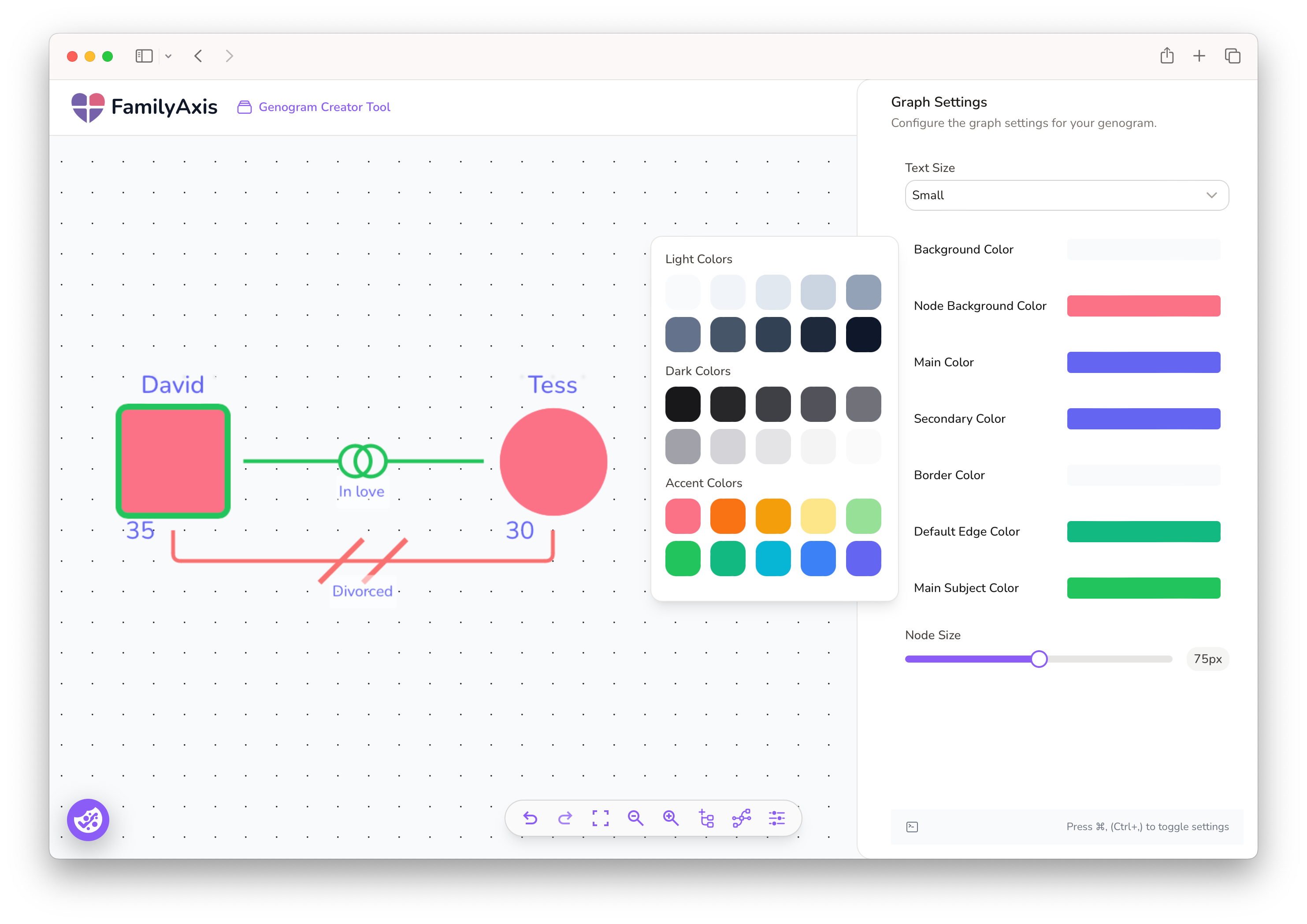
Step 5: Custom Visual Styles
A well-laid-out genogram is easier to interpret.
- Adjust Colours: Change the colour palette for nodes, border edges and main subject colour.
- Change Sizes: Adjust the Node Size and Text Size for optimal readability.
- Modify the Background: You can also change the canvas background colour here. Choose a light neutral shade for a professional report or a higher-contrast colour to reduce eye strain.
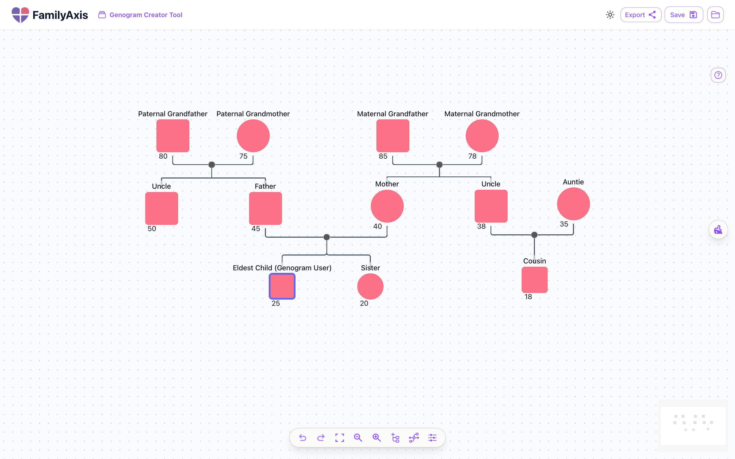
Step 6: Structure Your Genogram and Arrange the Layout
A well-organised genogram is crucial for clarity. The key to a professional-looking diagram is a logical structure, which is easily achieved using the drag-and-drop functionality.
Guiding Principles for Structure:
- Generations: Arrange individuals in horizontal rows, with the oldest generation at the top and the youngest at the bottom.
- Households: Group individuals who live together or form a core family unit closer together on the canvas.
- Spacing: Leave ample space between different family branches to avoid a cluttered look and make relationships easier to trace.
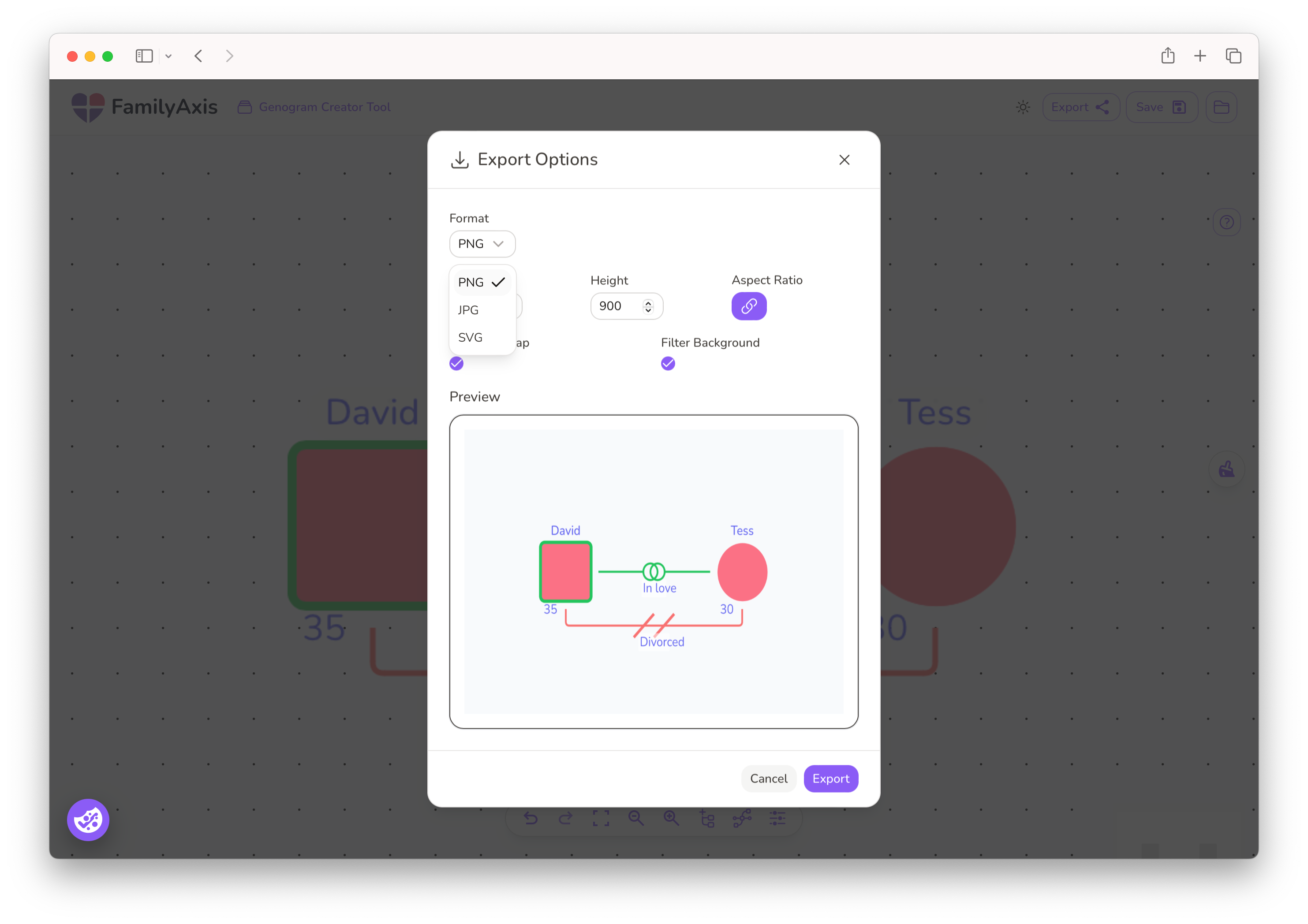
Step 7: Save, Export, and Present Your Findings
Your work can be saved or exported by clicking the appropriate button in the top right-hand corner of the page.
Select the "Filter Background" option to remove the grid dots from the canvas, which will give your exported genogram a solid, clear background.
You can export as:
- PDF: Ideal for printing and including in formal reports or client files.
- JPG: A standard image file ideal for presentations or sharing digitally.
- SVG: A high-quality vector format for scaling without loss of detail.
You've Created Your Genogram
You've now transformed a blank canvas into a clear, detailed map of relationships. The tool is designed to handle the technical aspects, freeing you to focus on understanding the connections and stories that define a family.
Whether you're a professional completing an assessment or an individual exploring your heritage, you've created a valuable visual tool that can reveal patterns and strengthen understanding. The time invested in building this diagram is a crucial step toward gaining deeper insight.
Need More Guidance?
If you're still feeling a bit lost, don't worry! We have more resources to help you on your way.
- For a complete beginner's guide, I've created this step-by-step walkthrough:
How to Make a Genogram: A Beginner's Guide - To see real examples in action, explore this article showing how to represent different family structures:
5 Genogram Examples and How to Make Them
These resources will give you the extra confidence to create clear and meaningful genograms.